


Introducing Bauhaus Design Tokens and Theming
Introducing Bauhaus Design Tokens and Theming
The Design Systems & Engineering team is excited to announce the launch of design tokens and theming in the Bauhaus library for React Native. The first component to be fully themeable is the Text component, with more to follow. This new foundation for styling Bauhaus components will help teams build consistent, maintainable user interfaces that can be easily adapted to varied and evolving design contexts.
What are design tokens?
Design tokens are named entities that store visual design attributes like colors, spacing, and typography. Instead of hardcoding values like #ff6b35 or 16px throughout our design files and codebases, we use shared names like color.text.brand.default or size.spacer.md. You can think of these as variables that point to values, and they can point to different values in different contexts.
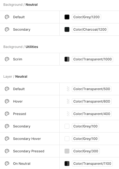
The kind of design tokens used by the Bauhaus library are “semantic” tokens. Semantic tokens are called that because they express stylistic choices in terms of their meaning and purpose rather than just their value. Using semantic tokens helps make our codebases resilient to evolving design decisions and intentional variation by making sure that styles that should change for the same reason are controlled by the same token.
Why design tokens matter
Consistency at scale
When multiple teams work on different parts of an application, maintaining visual consistency becomes challenging. Design tokens ensure that everyone uses the same shade of blue for primary actions, the same spacing for components, and the same typography hierarchy—automatically.
Team collaboration
Designers and developers can speak the same language. When a designer references Size / Spacer / LG in Figma, developers know this means size.spacer.lg in code.
Platform-aware design
Bauhaus tokens automatically adapt to different platforms. The same token resolves to touch-friendly sizes on mobile, precise measurements on desktop, and 10-foot viewing optimizations on TV—all without changing component code.
Effortless theme support
Want to support multiple brand themes? Different platform adaptations? Light or dark mode? With design tokens, these become configuration changes rather than code rewrites. Change a token value, and every component using that token updates instantly. And with our React Native theme provider (see below), these changes can take effect for the entire application or just a specific sub-tree.
Future-proof design decisions
Design evolves. When our brand guidelines change or we need to adjust spacing for better accessibility, design tokens let us update hundreds of components by changing a single value.
Theming
As stated above, one of the main benefits of using design tokens is how easy it makes theming. A “theme” is a curated collection of design token values that can give an application or section of an application a distinctive presentational style (for example, to support light/dark mode, a specific brand, or a platform).
Bauhaus supports theming via the BauhausThemeProvider component. The provider has a default theme, but if you pass themeOverride, all the provider’s children will use those values instead, letting you apply themes to entire sub-trees of the application. (BauhausPage also accepts a theme object letting you theme entire pages.)
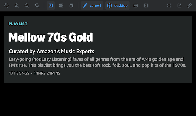
Today, the Bauhaus library includes two built-in themes that we’re calling coreLegacy and coreV1. CoreLegacy is currently the default theme, but, as the name suggests, we are working on migrating away from it, toward CoreV1, which supports the new Ember Modern font, an updated type ramp, and a more usable color palette.
Here’s an example of how you would use BauhausThemeProvider in code:
import { BauhausThemeProvider, bdsThemes } from "@amzn/bauhaus";

function App() {
  return (
    <BauhausThemeProvider themeOverride={bdsThemes.coreV1}>
      <YourApp />
    </BauhausThemeProvider>
  );
}
Documentation
To learn more about design tokens and theming in Bauhaus, check out our Storybook documentation. There you’ll find more details about the token architecture, an onboarding guide for using theming-related components and hooks, as well as complete references for all our semantic tokens.
You can also use the Storybook toolbar to view stories in different theme contexts. For example, select coreV1 and desktop to see what a Bauhaus component would look like with the new type ramp on desktop web.
Looking ahead
Today, only the Text component has been fully tokenized, but we plan to bring design tokens to more components to make them themeable as well. In addition, we are exploring how to use design tokens on other platforms besides React Native, like native iOS and Android.
As you begin to adopt design tokens and themes, please let us know how it goes. We’d love to know what your experience is like, and all feedback is welcome. The best way to get in touch is via our slack channel #bauhaus-dev-interest.
FAQ
As a developer who uses Bauhaus components, when and why should I switch to the new CoreV1 theme?
The Design Systems & Engineering team will take responsibility for migrating Dragonfly to the CoreV1 theme, so there’s no need for experience teams to do this themselves at this time. If, however, you want access to the new theme before that workstream is finished (for example, because you want to start using the new Ember Modern font right now), then you are welcome to use BauhausThemeProvider to adopt the new theme just for the experience you’re working on. (One caveat: your experience may look different from the rest of the app until everything is migrated over.)
My team already uses BauhausThemeProvider. Are there changes that I should know about? Is everything backward compatible?
The new design tokens are indeed backward compatible with what’s in use today. However, we’ve deprecated a few color tokens that no longer fit our token architecture. These deprecated tokens will remain available until Bauhaus 2.0, but we encourage you to update them to supported tokens before then if possible. (Specifically, make these changes: color.container -> color.background, color.interactive -> color.layer, and color.icon.base -> color.icon.neutral.)
What if I’m working on native code? Can I use Bauhaus design tokens and themes?
Not yet. This update only applies to React Native, but we’re investigating how we might share design tokens with native code in the future, so stay tuned.